|
|
Post by Reno on Nov 10, 2006 13:57:14 GMT -5
The text is just the Greek letters for Sigma.
So it would go Sigma, ( The I one) , Gamma, mu, aplha.
|
|
|
|
Post by Raistlin Majere on Nov 10, 2006 19:21:10 GMT -5
That's what I suspected. To tell you the truth, I liked the Sigma symbol setup better in the test wallpaper, with two Sigma symbols (glowing) facing each other. This one is fine, too, but I figure it makes more sense the other way. This is the kind of wallpaper that looks better when you have it full-size.
|
|
|
|
Post by Reno on Nov 12, 2006 22:42:33 GMT -5
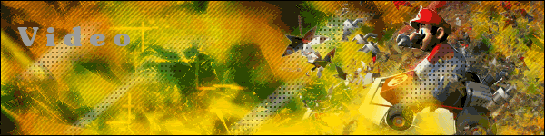
Heres another sigma one: Sigma Energy, using his classic two energies, Pink, and Blue. I didnt notice it until now, but there really is only three type of energy colors, Pink, Blue and Green. Any other color, wont work, it will look blocky and ugly, I guess only pink, light blues/cyans, and greens shade properly. Well, here it is. Uses massive brushes. All of it is manual, no filters. Just brushes.  |
|
|
|
Post by Raistlin Majere on Nov 12, 2006 22:53:18 GMT -5
That one turned out nicely. The background is very well detailed, great effect, and you somehow made the pink work. (I guess the classic Megaman color works here) I like the glowing hand and the symbol is well placed. One possible criticism would be that the image is basically a cartoon (But you can't really help that, since all images of Sigma would be), maybe by doing some additional blurring, etc. you could make the black cartoon lines (on his cape, especially) less noticable. Maybe blending the image into the background a bit more by modifying the color a bit? I don't know how well that would work out, but this turned out quite well, considering what you had to work with image-wise.
|
|
|
|
Post by Reno on Nov 12, 2006 23:09:51 GMT -5
Yes, but I dont mind the cartoon look. I couldnt imagine Megaman any other way really.
|
|
|
|
Post by Raistlin Majere on Nov 12, 2006 23:20:45 GMT -5
I suppose not. I don't mean finding a different image altogether, just perhaps modifying this one to blend more fluidly with your wallpaper. The background is very good, considering there wasn't a tutorial (But I bet there's reams of things you can do with your CS2 where brushes are concerned) Pink particle effect turned out well, too. How long did it take overall?
|
|
|
|
Post by Mecha on Nov 14, 2006 9:18:04 GMT -5
Say, is there a The Signature Thread or something similar on here? Because I realy want to post some of my works, but theyre mostly 800x400'ish. if there is, please give me the link
|
|
|
|
Post by Raistlin Majere on Nov 14, 2006 10:47:46 GMT -5
There isn't a thread specifically for that, but you could still post them here, if you wanted to. Either that, or you could create a thread that would suit you better.
|
|
|
|
Post by Reno on Nov 14, 2006 17:13:50 GMT -5
If you want mecha, you can make one.
|
|
|
|
Post by Raistlin Majere on Dec 3, 2006 18:56:40 GMT -5
It took enough time, but I'm now finished my first Raistlin wallpaper:  As is the case for most of the posted wallpapers, some parts of this one are not as easily visible than in the full-size one. This is especially true for this one, seeing as how there is a great deal of faded text. Nevertheless, it turned out well enough. The background effect might be too dominant, but not greatly so. There will be more Raistlin wallpapers, and the next one will be of a different style. |
|
|
|
Post by Jarlaxle on Dec 3, 2006 20:34:37 GMT -5
I would say that this is the best background effect you've made so far. The only thing that someone might find wrong with it is like you said, the background effect might be a little bit overwhelming. Other then that this kind of quality work is what i was expecting for a Raistlin wallpaper. Good job. 9.3/10
|
|
|
|
Post by Raistlin Majere on Dec 4, 2006 22:13:15 GMT -5
Yes, I like how the background effect turned out as well. I planned on making this one my final wallpaper with this style for now--fancy, intricate, glowing background with many faded images of the character. Of course, this one was different, with the faded text and more subtle placement of images and effects, etc. My point is, my next Raistlin wallpaper will likely have a less dominant background effect, more central images and the like. Any other feedback?
|
|